This is part of a wireframing series
- Overview
- First Draft
- Balsamiq
- Blend with Sketchflow
This is a companion post to my talk at welliDotNet, Wellington’s .Net User Group on Wednesday 4th April 2012. The slides can be downloaded here.
I want to give you a brief introduction to creating designs and mockups for applications from a developers point-of-view, to enlighten other developers on the cool tools available and to inform designers that there are tools out there that can create great UX prototypes for clients, that you don’t have to be a developer to use. I will focus on two tools, Balsamiq’s Mockups, and Microsoft’s Expression Blend with Sketchflow. Both of these are paid tools, and both have time limited trials available to use. I will also put some resources down that make mocking up a bit more fun.
Balsamiq Mockups
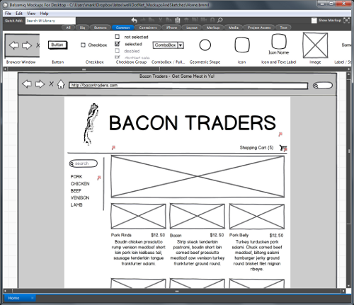
Balsamiq is a small distributed company, that make a neat piece of wireframing software called Mockups. There are a few flavours of this; a web based online version, a desktop version and a few plugin versions for SAAS products like fogbugs. I haven’t had much to do with their web version but have been using the desktop one a lot recently while design new screens for my current client. 
Some of the great features of Mockups I have seen so far are:
- Text Markup
- add italics, strikeouts and hyperlink styles and more to your text
- Tab Controls, Button lists
- UI Chrome such as Browser navigation etc.
- Icons
- Datagrid Control - create quick simple data grids with advanced markup options
- Dropbox Integration -collaborate on wireframes by leveraging the power of Dropbox
- iPhone Support - make your iPhone wireframes look awesome and iPhone like with sketch keyboards and outlines
And that’s just to name a few. I’ve found that there is a great variety of controls available, and I could build most of the UI I needed from controls out of the box.
As well as UI, there are Markup elements that can be used to annotate your wireframes, and these can be turned on or off when viewing, or generating images. On the side of generating, you can generate pngs, or inter-linked pdf files from your mockups, which include clickable parts of the UI that will link to other screens. You can also go into full screen presentation mode and show off your designs.
I could go on and on, there is so much it can do, and it will be sure to do even more as new versions are released. There are trials for both the online and desktop versions so I would recommend giving them a go. I will follow this quick informational session with a post dedicated to using Balsamiq Mockups soon. If you can’t find the control you need, I found these great resources and plenty more on Mockups To Go, including WP7 templates and templates for other mobile platforms. If you the price seems a bit steep, maybe check out this post that lists a few free alternative products.
Microsoft Expression Blend
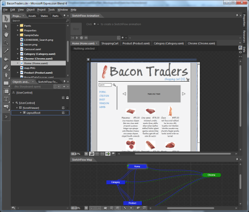
Microsoft Produced a suite of tools to go with their Xaml/UI/UX offerings collectively known as Expression Studio, that includes Expression Design, Expression Web(more for html), Expression Media Encoder(more for streaming video) and Expression Blend. Expression Blend is the main xaml development tool, and is essentially attempting to be Visual Studio for designers/devigners which supports solutions and most projects, but presents a designer-centric view for building and maintaining the xaml UI files for your applications. This includes support for WPF, Silverlight and Silverlight for Windows Phone (and windows 8’s WinRT UI stuff). One thing that was added to Blend around version 3 was Sketchflow. 
Sketchflow is a plugin/extension style framework that builds wireframing into blend. Essentially you create a Sketchflow project which sets up all the things you need to have to build a Sketchflow application, and the UI gets a few extra panels, options for navigation, as well as a theme the sketch styles. These styles make your application look like it is hand drawn, instead of the usual polished controls. And thats where most of the hard work is. Apart from navigation and the sketchy look, you just appear to be in a development environment like any other Xaml based application. You have code behind, behaviours, xaml, drag and drop, and the full properties options and visual tree and the rest.
The only other difference comes when you run it. Running your sketchflow app gives you the sketchflow player. This adds a left-hand-side to your application with a few cool options, and can be used for navigation (shows the links of where this page goes) and a feedback system which is pretty sweet. More on feedback later. Sketchflow has 2 flavours: WPF and Silverlight. This has no reflection whatsoever on what the application you are designing is (although for reuse this could be important) but more of how you wish to distribute it. If you go with a WPF Sketchflow Project, you get a desktop sketchflow application, that can be distributed in a zip file and runs on any machine with the correct version of .Net installed. Easy enough to share if you don’t mind helping the odd person get .Net installed, if necessary.
However, if you go with the Silverlight Sketchflow Project, you get a fully functional Silverlight Xap and html file. Why this is cool, is that you can host this on your website. You could even take the xap and host it inside a blog post for a demo if you wanted to (and in fact I might when I go into depth with Sketchflow). Users can go to your site (or other designated area, such as intranet) check out your wireframes, create some feedback, and save the feedback and send it to you in an email(or file share, or upload form etc). Its a pretty neat way to distribute your wireframes for feedback I must say.
Being a full fledged xaml application, you can build and use custom behaviours, write code-behind to perform other actions, and script sweet UX animations. As a developer, you can build up your own library of behaviours to speed up prototyping in your domain, or company, and make these available to the rest of the team, developer and designer alike, to speed up prototyping, as well and being able to use them in your production build. This is the power of Sketchflow over something like Balsamiq Mockups. Your application becomes heavily interactive. How interactive is up to you. you can have something as simple as navigation links between screens, to a full fledged UI that has carousels, pivots, scrollbar areas, double-click support, complex transition animations, and be a full fledge prototype of your user experience, without the look and feel of being ‘complete’. It will continue to look like a hand drawn application but will live and breathe like a real application. Pretty swish and hot to impress your next client I reckon.
I will also be following this section with at least one dedicated post with a quick demo and sample files.
Fun Tools
I stumbled on this great post for some cool placeholder image generation tools for putting fake images into your mockups. I had come across placekitten.com which I thought was a great addition to the placehold.it idea, as is flickholdr.com, pulling images off of flickr. Here are some posts that list a few in greater detail. There a few different ones that can be a bit of fun, and perhaps meet your own personal tastes.
- http://www.learnphponline.net/the-top-8-placeholder-services-for-web-designers/
- http://net.tutsplus.com/articles/web-roundups/the-top-8-placeholders-for-web-designers/
Another fun thing to play with is generated text. Lorum ipsum is the standard for generated text, and there are plenty of generaters on the web to choose from. But why not mix it up and try bacon ipsum, samual l. ipsum or gansta lorum ipsum? There are heaps more to choose from, and a few sites that have listed them are below.
- http://www.queness.com/post/9327/13-funny-and-useful-lorem-ipsum-generators
- http://mashable.com/2011/07/15/lorem-ipsum-generators/
- http://designshack.net/articles/inspiration/30-useful-and-hilarious-lorem-ipsum-generators/
Bacon ipsum dolor sit amet est venison consectetur, ham hock sint cow voluptate deserunt hamburger sunt officia. Adipisicing pariatur dolore dolore filet mignon. Pig tail tenderloin pancetta. Et eu ham incididunt, leberkas ground round rump culpa proident beef ribs. Biltong capicola speck, eu aute culpa pork loin ball tip fugiat laborum jowl swine. Aliqua dolore in, quis duis eu ut shankle biltong brisket. Voluptate minim ut dolore, do adipisicing fatback. {Sorry, couldn’t resist}
Slightly related to the whole mockups theme, I found this link for great Windows Phone 7 mockups and wireframing tools that you might find useful if you are doing any of that sort of thing like me. - http://inspirationfeed.com/graphics/freebies/20-free-windows-phone-7-mockup-and-wireframing-resources/
So that is what I have on mockups and sketches, and a few ways to add some life to your samples. As I said, I will follow this up with some demos on both Mockups and Blend with Sketchflow soon.